Fruigo
A vibrant fruit-based FMCG identity created across logo design, packaging and promotional campaigns.
A fresh and playful brand identity designed to communicate natural ingredients, joyful energy and strong shelf appeal across fruit bars and juice products.
About Project
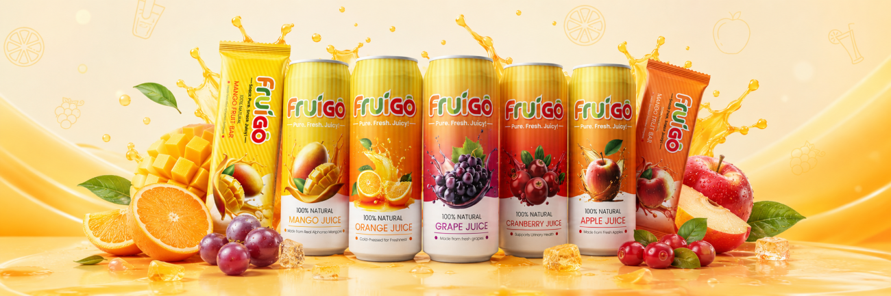
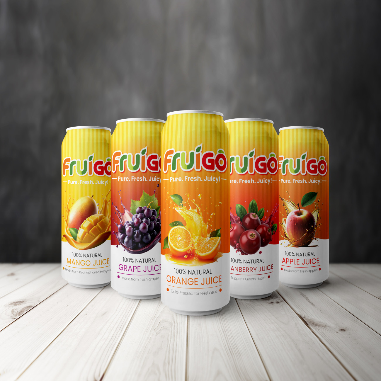
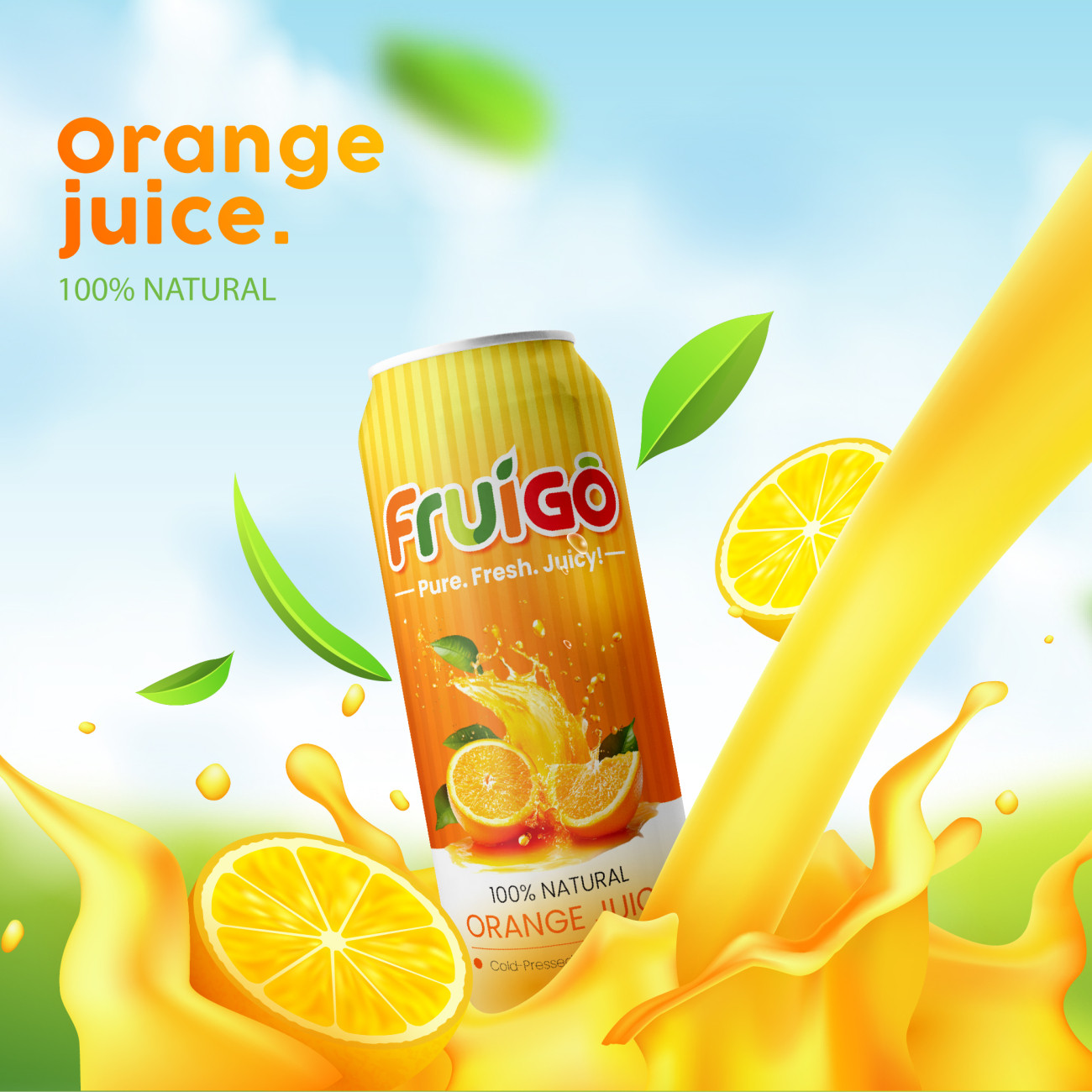
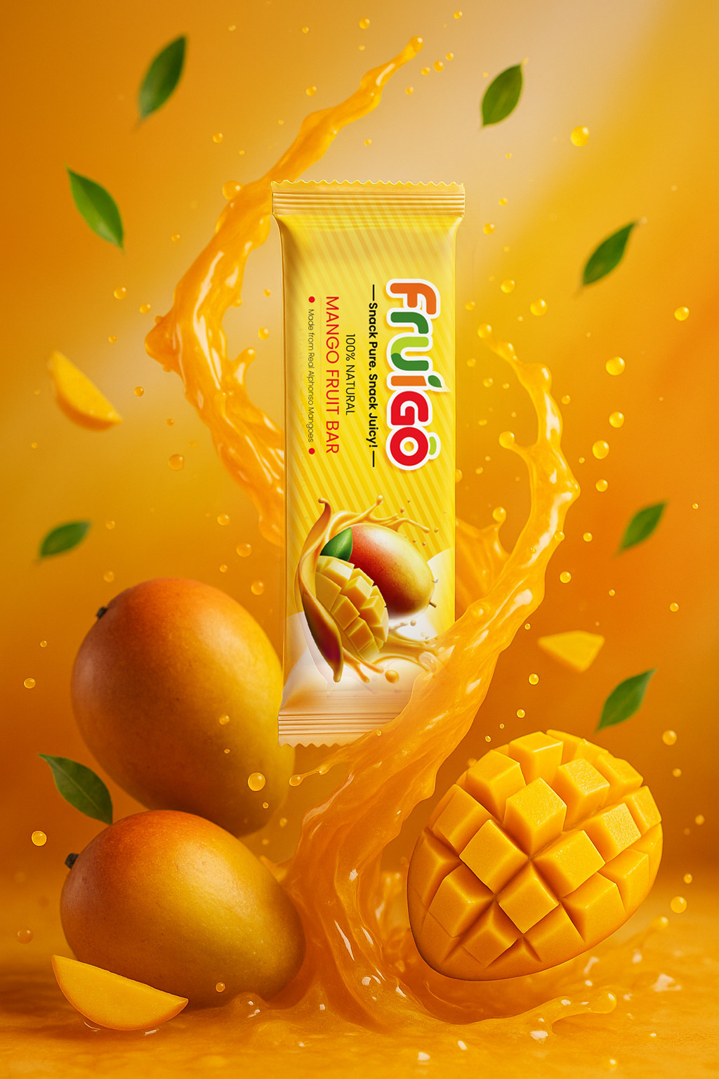
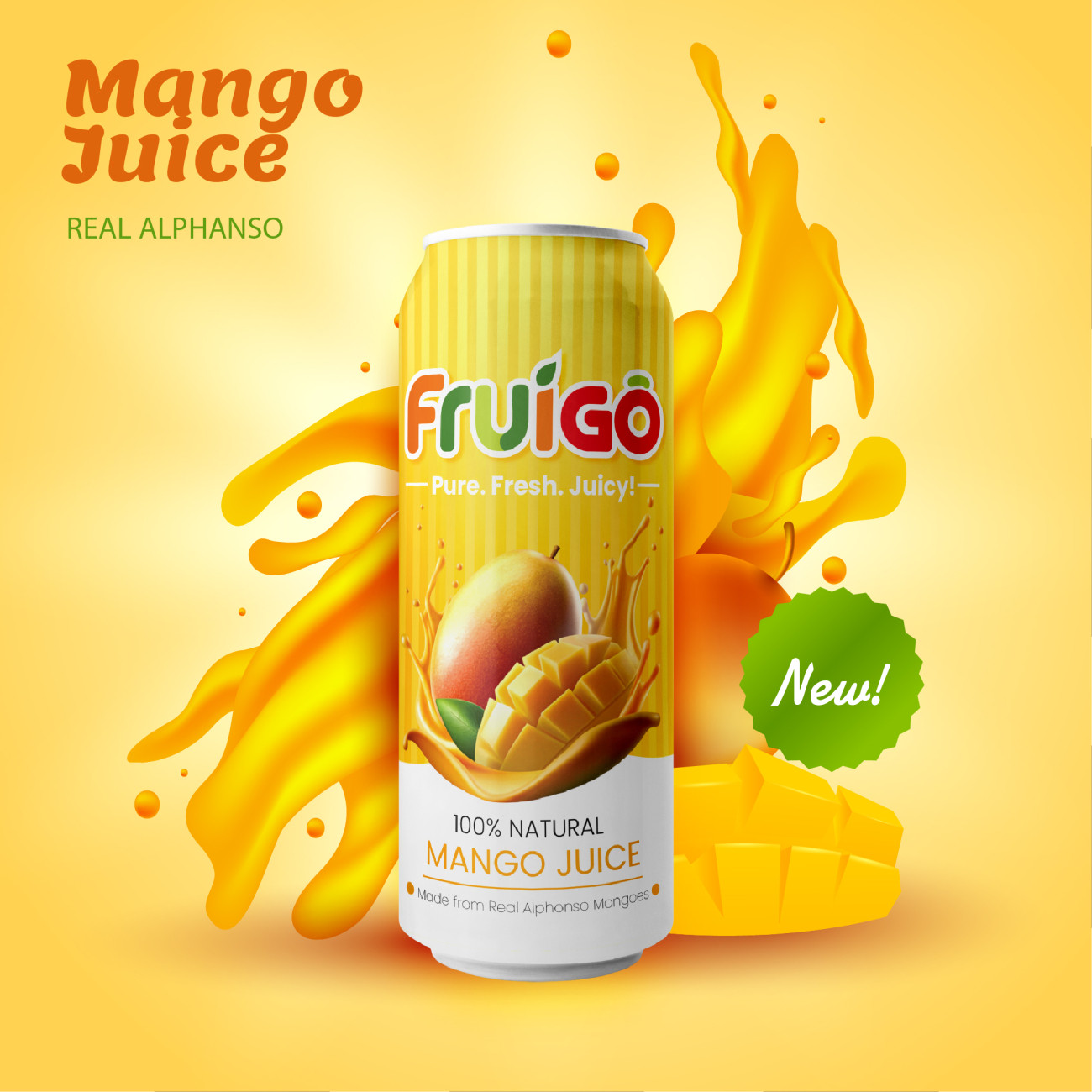
Fruigo is a fruit-based FMCG brand based out of Hyderabad offering fruit bars and ready-to-drink juices. The project focused on creating a fresh, colourful and energetic brand identity that could connect with consumers while maintaining consistency across different products, flavours and promotional applications.
Project Brief
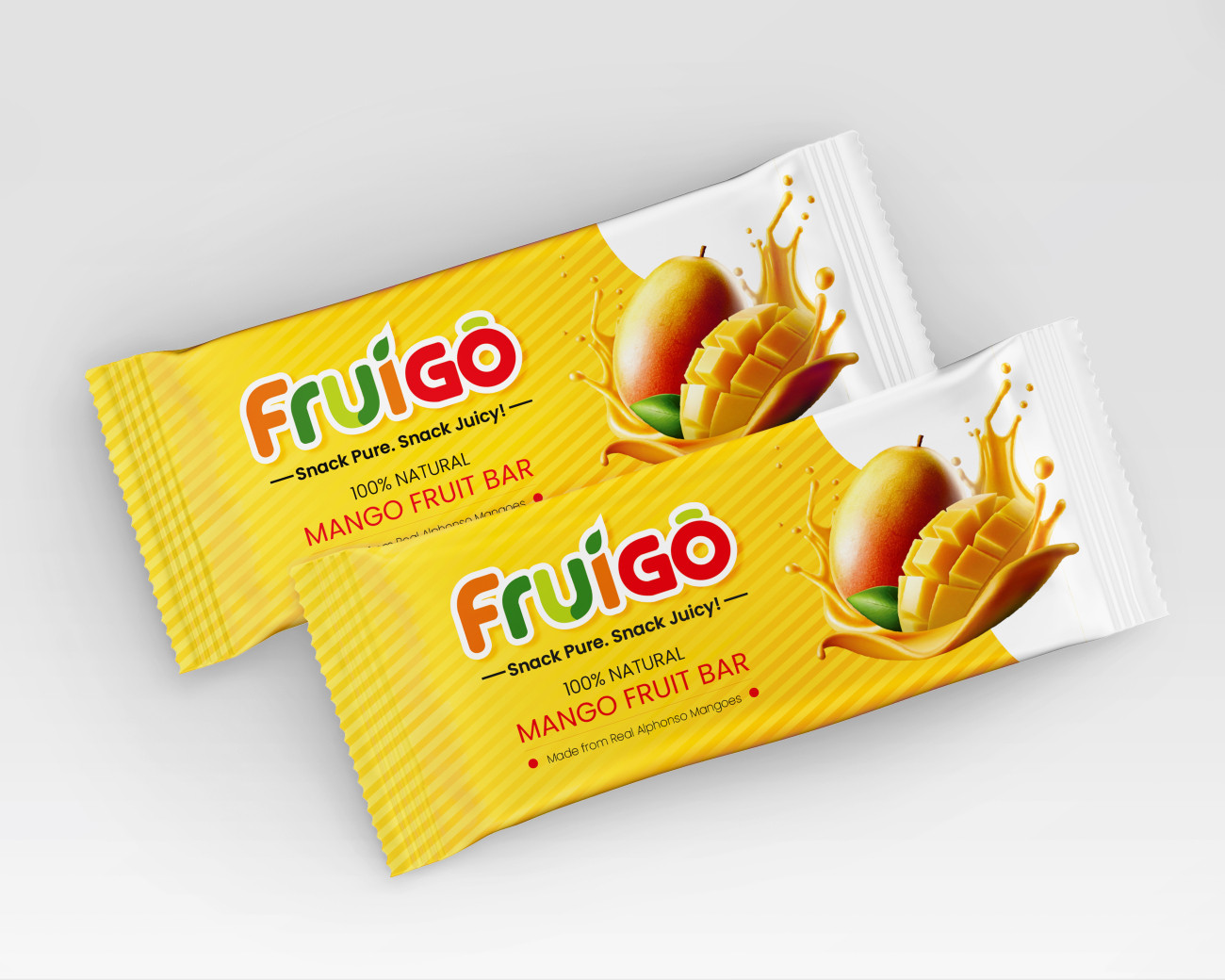
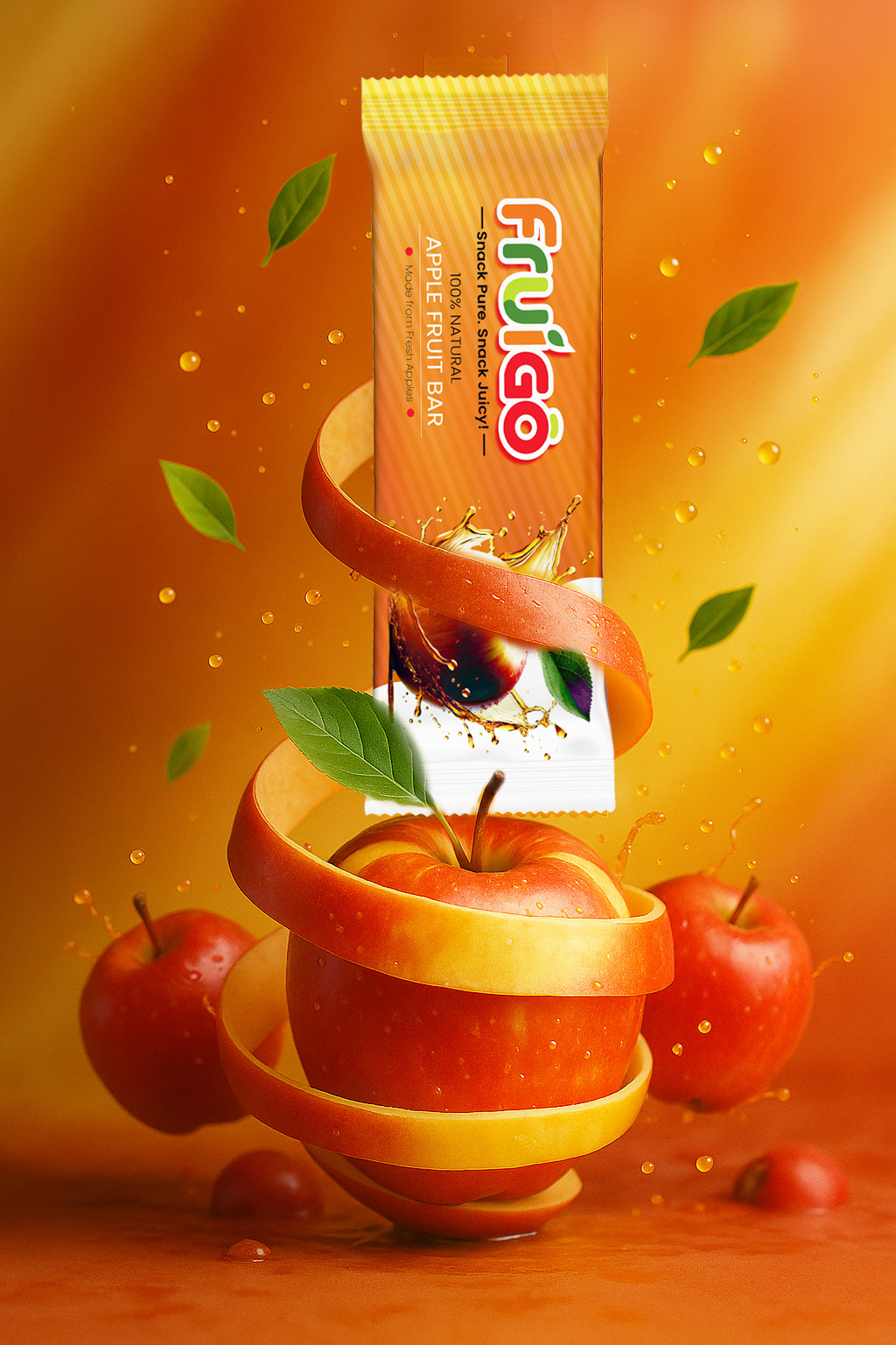
The project required a complete visual identity and promotional design system, including logo design, product packaging, promotional posters and outdoor advertising boards. The objective was to create a playful and consistent brand language with strong shelf visibility, clear flavour differentiation and flexible application across print, packaging and outdoor communication.
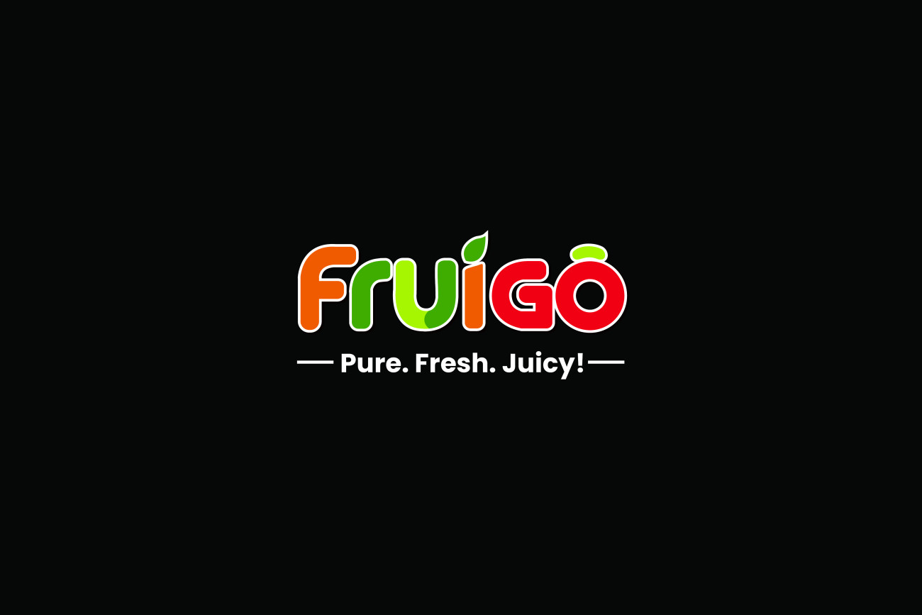
The rounded wordmark, fruit-inspired colours and dynamic splash graphics create a lively identity that adapts easily across every Fruigo product.